Movie advertising. It’s often the first exposure a person has to an upcoming release, so it’s crucial that a film’s trailer and poster are both enticing and representative of the film, expressing the same look, feel, and tone that a person will experience while watching the movie. At best, a successful movie advertising campaign will put butts in seats. At worst, well … it won’t. It’s a sad day when no one watches a great movie because of bad advertising. I’m pretty sure a puppy gets cancer each time this happens.
Think back at some of the iconic movie posters that have become so ingrained in pop culture that they’ve become art, themselves. E.T. Schindler’s List. American Beauty. Raging Bull. The Silence of the Lambs. All with great movie posters. To date, the tradition of great advertising continues for some films. For others, not so much.
Take a look at these two hits and two misses and share your thoughts in the Comments section.
Hit
It seems fitting (like a bed sheet—see what I did there?) that a movie about a sex addict would have a poster that simply and graphically depicts the place where all the magic happens. There’s a clear story here. The sheets are disheveled and wrinkled. Someone was just in bed. Who? The simple, yet powerful title, Shame, rests comfortably atop the mess that was left behind. What shameful act happened here? On December 2nd, we’ll find out.
Miss
This is a clear miss. Yes, the title is treated in a gold tone, a nod to the large sum that the ragtag crew in this comedy caper is conspiring to capture (deep breath), but other than that, it says nothing about the film. Ben Stiller. Eddie Murphy. A Tower. Is that all we really need to know about this movie? Perhaps. Any movie with a poster that features blatant shots of the actors staring into the camera doing absolutely nothing is a movie that’s banking solely on the talent to sell tickets, leaving one to wonder if there’s a story or any other redeeming qualities at all. I admit, the trailer got a few chuckles out of me, but I won’t be paying to see this when it hits theatres on November 4th.
Hit
Spoiler Alert! This is one of the better posters of the year, advertising a truly great film. The use of Time conveys the political nature of the movie. The look on Ryan Gosling’s face and his loosened tie indicate a man who’s clearly been through an emotional wreck. And then there’s the obvious element here that makes you do a double take: the blending of Gosling’s face with George Clooney’s, foreshadowing how the two characters eventually become one in the same throughout the course of the film as we discover one character is just as dirty as the other. This effect of melding the two faces together both works with the film’s story and also serves as a clever trick. The designer of this poster surely knew people would spend some time gazing at it, picking out the subtle similarities and differences in both actor’s faces. Anyone in advertising knows (and I work in advertising, so I know), the longer you stare at an ad, the better it is for business (or in this case, ticket sales). The film is currently in theatres.
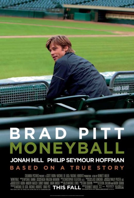
Miss
The good news is that Moneyball is one of the year’s best films, worthy of multiple Oscar nominations. The bad news is that the film’s poster makes you believe the movie is more in line for Razzie consideration. Seriously? Brad Pitt sitting in bleachers? Doing nothing? Literally, just sitting and looking? This picture looks like it was taken as a candid shot in between takes during shooting—something that would appear in a behind-the-scenes retrospective, not in the primary selling vehicle for a movie. Luckily, the film has enough great qualities to help it stand on its own. But who’s going to see it if its advertising implies otherwise? But seriously, go see it. It’s in theatres now.


I think it’s important for movie posters to accurately reflect what a person will experience while watching.
LikeLike